Analysis of media texts; Front cover, Contents and Double Page Spread
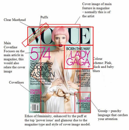
Codes and Conventions of front cover, example magazines - Vogue and Blender° Clear layout
° Masthead - the masthead is the title block for the magazine, usually this is the most eye-catching convention on a page and has to be distinct, quite often this will become the magazines icon. ° Ethos of the glamourous lifestyle of a artist, clearly feminine 'power issue' emphasising dominant female role. ° Range of linguistic features e.g. key words, sentence types ° Colour scheme - small amount used with a simple colour scheme adding to the distinctive design. Pink and soft blue creates a feminine feels. ° Coverlines - lines of text on the front cover designed to attract the audience’s attention and make them pick the magazine up and look inside ° Main coverline - This is the largest text on the cover after the title and it anchors the meaning of the image. Usually a sub line in smaller text giving more information about the article. ° Cover image - models appealing to the reader, often take up the majority of the page through a close up or medium shot. The image will normally contain one model that has direct address to the audience ° Accessible language ° Puffs - Offer something else to the magazine, often relate to competitions or free gifts because they grab the readers attention. 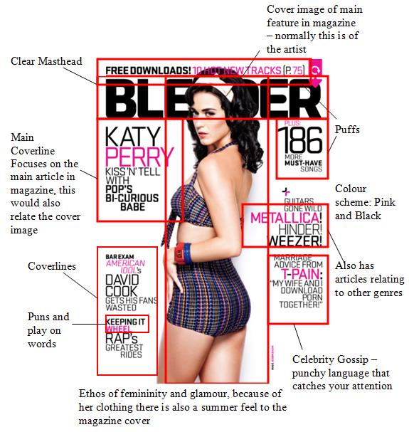
Contents page from KERRANG! Magazine - well set out contents page featuring key elements for a music magazine contents page.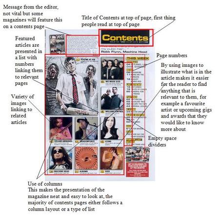
Double Page Spreads° Simple colour scheme - colours kept to a minimum.
° One large picture which takes up a whole page and sometimes bleeds between pages ° The picture is across the whole dps with all text on the picture. ° Standfirst introduces the article, under the headline - often includes the journalists name. ° Drop capital used at the start of the article, to show the reader here to start. ° Other techniques include, bold texts, slightly bigger typesize, capitals for the first few words. ° Headline sometimes used styleised fonts and are used to draw the reader in ° Byline - who wrote the article and often photographs credit. ° Arranged in columns 2-4 ° Strapline at the top - what the article is about. ° The article is usually written informally and with the personality of the journalist. 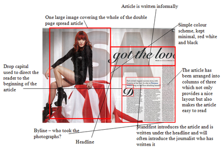
The Vaccines DPS - NME Magazine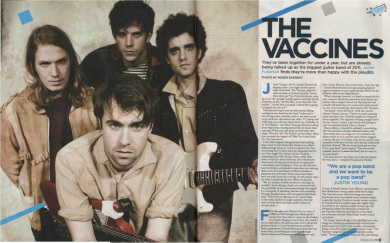
Here is another example of a DPS from music magazine NME, this article is from a completely different magazine, featuring a different band and colour scheme ect. But we can see how codes and conventions keep the layout of pages such as these consistant throughout all magazine types.
|
Contents Pageo Basic colour schemes; black, yellow, and red shows a clear genre of a rock magazine - male dominated.
o Use of columns. o Variety of images linking to various articles within the magazine. o Featured articles are placed on the contents page to show what's in the magazine. o A message from the editor is can be found at the top of the contents page welcoming new readers. o Smaller images on the contents page link to other stories featured in the magazine. o Page numbers and captions linking to stories are in different fonts and colours to make them stand out to the reader. o Magazine subscription. o Buzz words are featured on the contents page to link to stories. o The word "Contents" is always found at the top of contents pages so it's the first thing people read when they open the magazine and consists of the same font as the main title. o Empty space divides different articles and the mastheads on contents pages are sometimes smaller or similar to the covers masthead to show continuity. o In the list of contents, the page number will always come before the text and will follow with a few words e.g. the artist name, ambiguous texts to entice the reader in either bold/ capitals and usually in 13/14 size font. A sub-line comes after this and is in more detail about the article in a smaller and usual roman font, it is never in any font bigger than size 11. 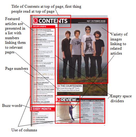
Double Page Spread taken from Q Magazine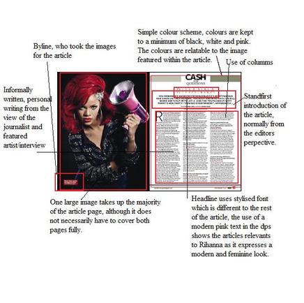
Rihanna Double Page Spread Analysis
The image presented is of Rihanna holding a speaker-phone prop and looking aggresively towards the camera. Her pose would be idealy linking with the article purpose, the microphone suggests speaking out or making herself heard. By using a black background the artist stand-out well, but also her stance makes her look powerful. The pink speakerphone gives that feminine touch which is relevant as Rihanna is known as a strong female figure. (The caption to the bottom left of the image picks out the red colour from her hair.) In terms of the article page and it's layout and text, the top is centralised. The use of three columns beginning with a large R to mark the begining of the article is a common convention for a double page spread. Unlike the serif font used throughout the rest of the article, her name is in a different font and therefore stands out at the top of the page. The sans-serif font has a sleek modern look which also has connotations of youth. It also stands out as it is a dark reddish colour. This red colour is also picked out from the right image |
