Manipulation of Images
Front Cover
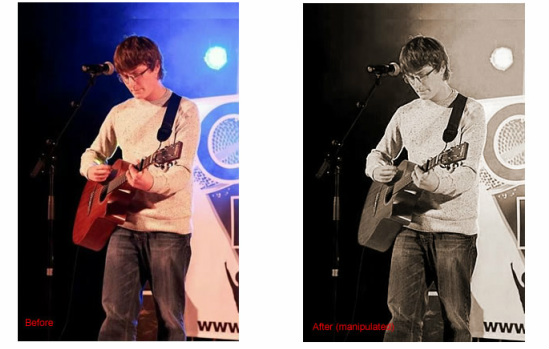
This photo was orignially taken at a gig that James was having in Brighton, the use of an real unsigned artist for my photos was really helpful to fulfilling the genre of my magazine fully and gave the magazine an authentic feel. However I did not like the use of colour on my original mock up design and by looking at examples of covers of Kerrang! and NME I found the use of a sepia tone far more appealing to the eye and it stood out amoung other magazine covers. When editing this photo i used a sepia tone however, I also wanted to enhance the image so that the blur of the original photo was lost. I did this by deepening the sepia tone of the image and increasing the sharpness by a few levels, just enough to reduce the blur and enhance the image without looking overly edited - in my opinion over editingwould cause the image to loose the appeal of an 'on site' shot.
Contents Page Images
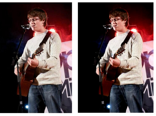
For my contents page images I used a different image from the same gig so that the topic was still relatable to the front cover but did not appear copied. For this image I also enhanced the colours to create a clearer shot but also adjusted the levels of image brightness. By doing this the image of the artist became clearer and more editorial looking, like the other photo it also lost some of the blur due to issues such as the smoke machine and humid environment of the stage area.
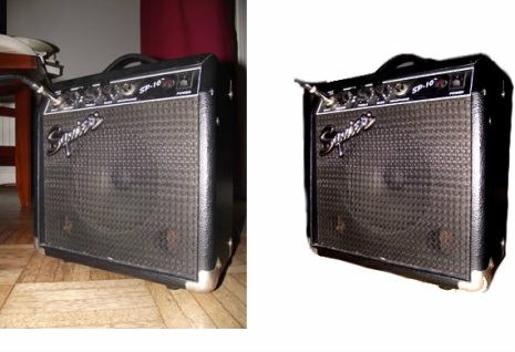
This image is also for my contents page however unlike the other image i did not want the whole photo as the chair in the background and curtain would look unproffessional and 'sloppy'. Therefore i cropped the image so that only the amp was visible and like i had done with all my images i also adjusted the colour levels and overall enhancement of the image.
Double Page Spread Image
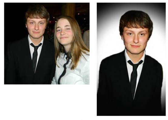
This image involved the most editing of all because I did not actually plan this photograph, it was instead taken as another of James's gigs which was at a 'black tie event'. I thought that I would still like to include this image within my magazine as it was an overall nice photograph of the artist and gave an alternative appearance to that presented on the cover. I was able to create the appearance of a photo shoot by making some adjustments to the image.
For this I cropped the photograph so it only presented the artist and edited the background to a white colour (traditional in many magazine for portrait shots). On top of this i added a black shadowing around the edges of the image which not only gave a nice effect of breaking through darkness (e.g. representing the struggle into the music industry) but also through doing this shadowing I was able to smoothly blend the image into the page which contained the interview.
For the double page spread image i also increased the contrast and adjusted the colouring of the skin tone and eyes to give a more editorial feel as 99% of images within magazines are enchanced to make the artist appear flawless.
