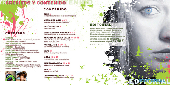
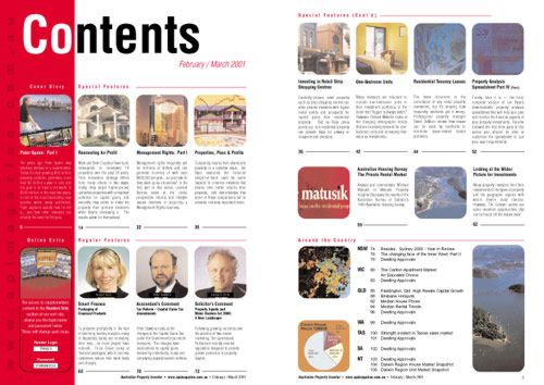
Codes and conventions of a contents page
Codes and conventions are used to create a format for magazines to follow, each area in a magazine will contain different codes and conventions. For example the codes and conventions of a front cover page compared to a contents may be similar, but will never by identical.
- Basic colour schemes are usually used to make it easy on the eyes and consistent with the front covers colour scheme, it usually shows a clear genre.
- The writing on the contents page is usually set out in columns.
- There is always a main image on the contents page which links to the main story of the magazine.
- Featured articles are placed on the contents page to show what's in the magazine.
- Deals for magazine subscriptions are usually featured on the contents page so that readers can subscribe and have the issues sent to them directly.
- A message from the editor is sometimes featured on the contents page welcoming new readers.
- Smaller images on the contents page link to other stories featured in the magazine.
- Page numbers and captions linking to stories are in different fonts and colours to make them stand out to the reader.
- On the contents page a website is usually featured at the bottom as its least important to the reader.
- Sometimes Buzz words are featured on the contents page to link to stories.
- The word "Contents" is always found at the top of contents pages so it's the first thing people read when they open the magazine.
- Magazines always use size 11 font and consistent throughout to make it aesthetically pleasing.
- An introduction of what's in the issue is usually written by the editor on the contents page.
- Sometimes credits to the photographer who took pictures for the magazine will be featured on the contents page.
- Empty space divides different articles and the masthead on contents pages are sometimes smaller or similar to the covers masthead to show continuity.
- In the list of contents, the page number will always come before the text and will follow with a few words e.g. the artist name, ambiguous texts to entice the reader in either bold/ capitals and usually in 13/14 size font. A sub-line comes after this and is in more detail about the article in a smaller and usual roman font, it is never in any font bigger than size 11.
|
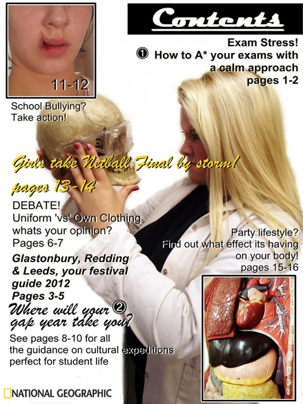
< Mock up of a contents page for a school/college magazineMy contents page design continued from the that i developed within my final
draft coverpage. I also followed on from the main cover lines from the coverpage and gave them a number so that they were recogniseable from the front cover, something which is a traditional thing to do in any magazine. I had also looked at images of other contents pages from other school, college and university magazines to gather ideas on how i should set out my contents page. Images from other school/college magazines
|